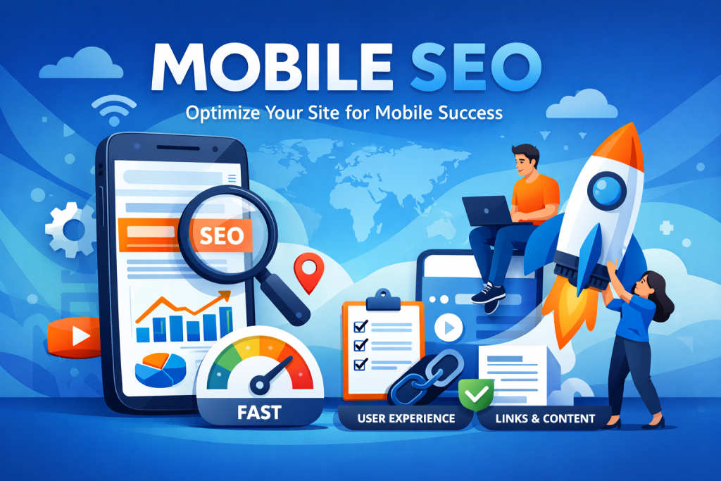
Introduction:
“If your website isn’t mobile-friendly, you’re silently losing customers every single day.” In this digital world, everyone is using smartphones. Whether it might be ordering food, checking social media, shopping, or searching for services, people prefer doing it all on mobile. In the recent survey, 60% of website traffic comes from mobile devices. So, if your device is not mobile-friendly, you are missing the major chances to get more traffic for your website. This results in customers going to your competitors. Here, mobile-friendly SEO plays a major role. It’s all about making your website easy to use on mobile devices, so visitors can use it comfortably on mobile. In this blog, you learn about how mobile-friendly SEO can boost your traffic.
Why is mobile-friendly SEO important?
Google prefers mobile sites:
Google now uses mobile-first indexing. It checks how your site works on mobile before giving a ranking to your website. If your website works only on desktop, you will have a high chance of getting a low ranking.
People don’t wait around:
Visitors come to your website, and they expect your website to be fast, smooth, and simple. Slow loading and not having proper alignment cause visitors to leave within a few seconds, which increases your bounce rate, which affects your website negatively.
User experience gives more traffic:
If your website has a clean, friendly design, visitors will stay for a long time, and they will explore more pages. It has a higher chance of converting visitors into paying customers.
How mobile-friendly SEO boosts your traffic:
Higher ranking:
Google gives higher preference to mobile-friendly websites that will appear higher in search results, which will attract more organic visitors.
Faster load times:
Improving images by trimming unwanted code makes your site load quickly and keeps users engaged.
More engagement:
Easy navigation, readable content, and clickable buttons attract more users.
Lower bounce rate:
Users get a smooth experience while using your website; they won’t leave your website quickly, which improves your SEO performance.
Competitive edge:
Many businesses don’t have mobile-friendly SEO; if you have that, you will stand out from them and get a higher chance of a higher ranking.
Key features:
Responsive design:
Your website should be automatically adapted for any screen, like desktop, tablet, or mobile.
Easy to navigate:
If your website has easy-to-navigate links, it is useful for visitors to navigate.
Fast loading speed:
If your page loads more than 4 seconds, there is a higher chance of leaving your website. So your website should compress images, use lighter code, and test speed with Google Pagespeed Insights.
Easy to read content:
Usage of short paragraphs, bullet points, font size (12 to 13). It will help to read the content easily. Mobile users prefer scanning content quickly.
Improve images and videos:
Large media files slow down mobile sites. Use a compressed format like WebP and confirm that your website is mobile-friendly.
Local SEO optimization:
Most of the mobile searches are local, like” best restaurant near me”. Adding your business to Google Business Profile and using location-based keywords can bring nearby customers to your site.
Quick tips to improve mobile SEO:
- Using Google’s mobile-friendly test tool, you can test your site.
- Remove the unnecessary pop-ups that cover the whole screen.
- If you publish a blog or news, use AMP( Accelerated Mobile Pages).
- On your website, the call to action button is visible to your website user and easy to tap.
Conclusion:
Browsing on mobile devices happens day by day; you may lose many users if your website is not mobile-friendly, whether your website has faster navigation, faster loading, or a responsive design on the desktop site. If a website is mobile-friendly, it attracts more users and the website will be in a higher rank in search results.
Read more: https://seoagencyindubai.co/8-most-common-seo-mistakes-and-how-to-fix-them/


